MISSION & VALUE
Vietnam has a unique cacao flavor and it’d be a wasted opportunity if Vietnamese people have not tried this special taste.
Our goal is to create quality chocolate with international standard for Vietnamese people. We want everyone to know more about our country’s chocolate and encourage them to consume chocolate for a healthier life. Our company were founded by Vietnamese leaders, using our nation resources and manufactured by our citizen. By our unification and passion, we aim at raising Vietnamese product value and bring Vietnamese chocolate to a higher standard.
PRINCIPLES
Dedication
One of our brand principles is the dedication toward the customer. The chocolate production in Figo is a process that is cultivated with dedication within every chocolate bar. We want our customers to sense the unique flavor of Vietnamese chocolate.
Friendly
Just like our mission to bring Vietnamese closer to high quality chocolate, it’s crucial to create a consumer-friendly image. Figo bears the vision of a Vietnamese daily companion. In a hustling world, Figo will be a sweet treat to help you relieve stress and cope with your job.
Healthy
Chocolate is a nutritious dish and it will help people improve their life quality. At Figo, we launch quality product lines to encourage people to have a habit of eating chocolate, based on their age and needs. Figo believes that introducing quality chocolate to Vietnamese is not helping them access to valuable food but also encouraging them to have a healthy life.

One of our brand principles is the dedication toward the customer. The chocolate production in Figo is a process that is cultivated with dedication within every chocolate bar. We want our customers to sense the unique flavor of Vietnamese chocolate.


To choose a softer and more elegant font to complement a powerful font like Futura, I chose the Josefin Sans font. Both fonts share a similarity is that they look energetic and modern. It is exactly the characteristics that Figo needs.


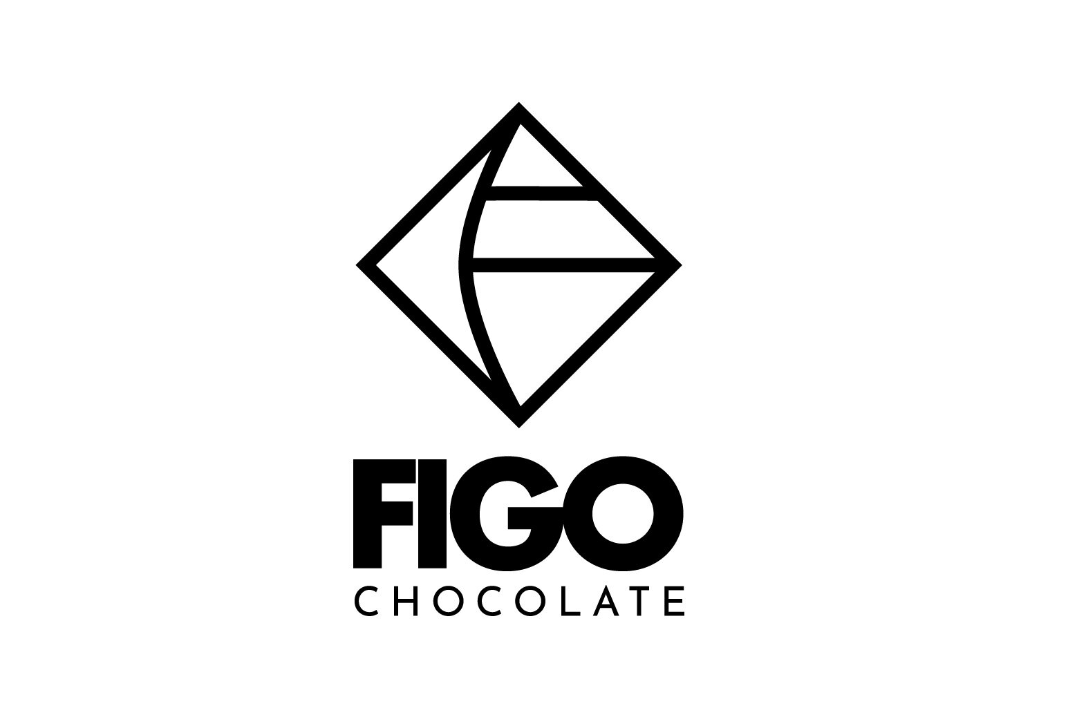
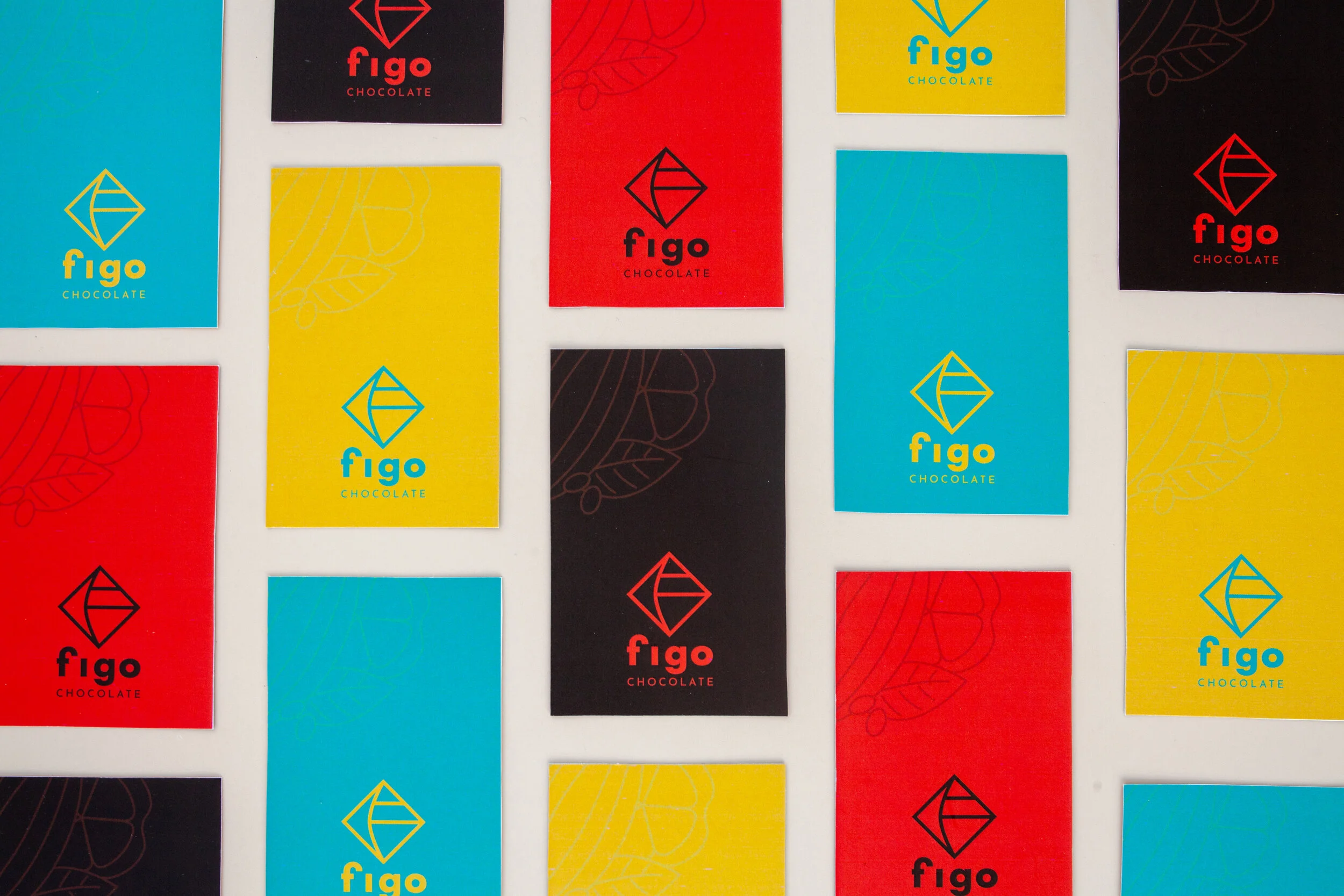
LOGO DESIGN
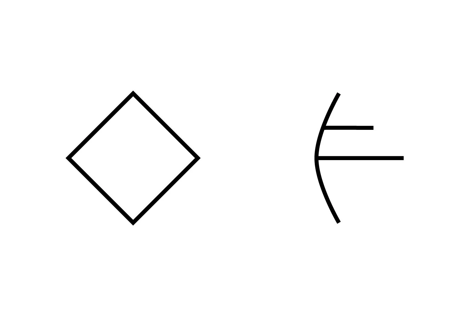
Figo's logo is inspired by the three principles that Figo wants to convey to our customer. Figo thinks that it is the core and is how we differentiate ourselves.


LOGO VARIATIONS


SUPPORTING GRAPHICS
In Figo, all stages from planting to chocolate production are equally important. The supporting graphic is inspired by the components of cocoa trees, emphasizing the dedication principle of Figo.

INCORRECT USE
The foreground and the background should not be separated.

The logo should not be in square.

The stroke should not be too thick or thin.

The letter placement should not be changed.

The supporting logotype should not be rotated.

The supporting logotype should not be placed on the main logo .

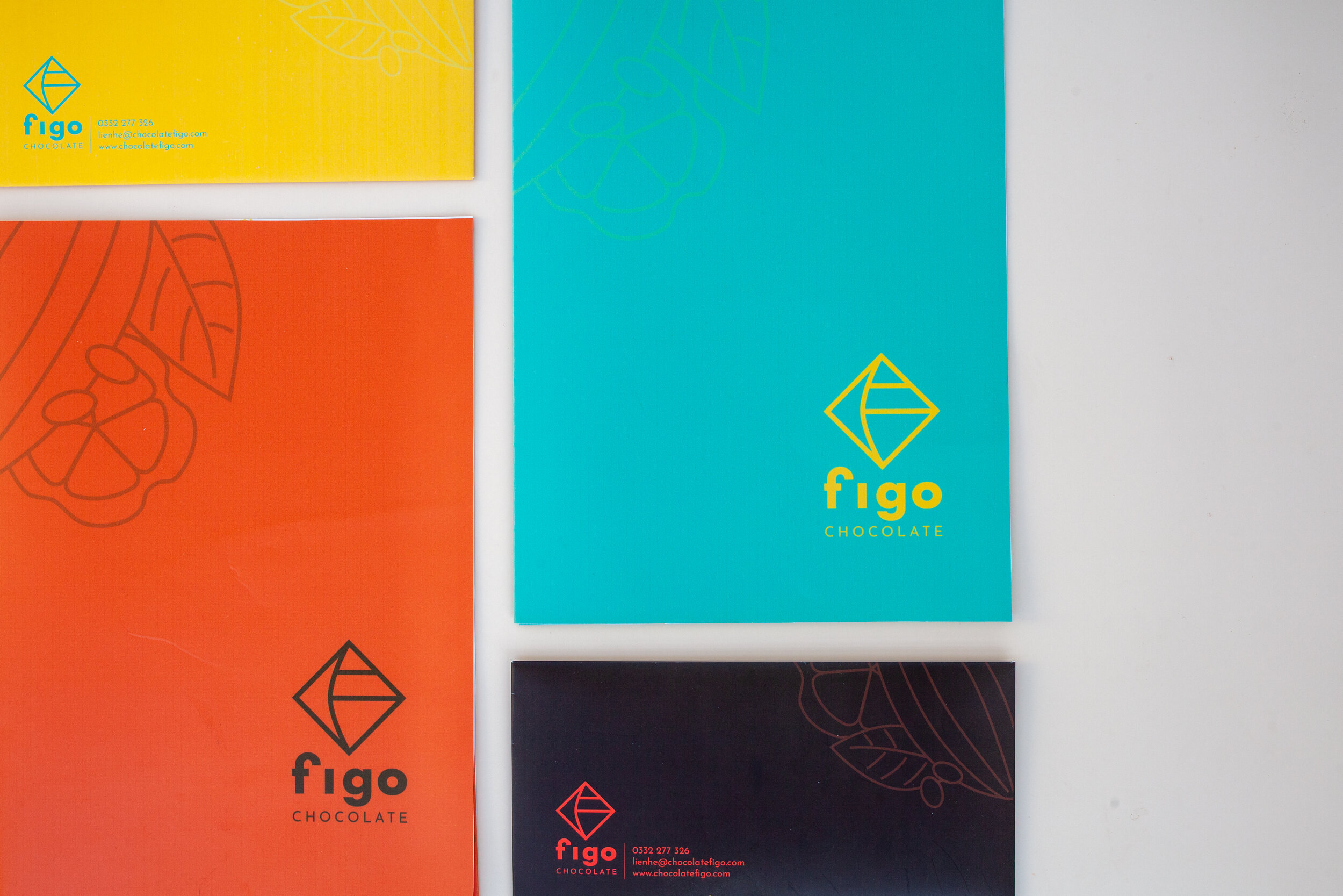
In general, the color palette is inspired by the origin of Figo chocolate, which is Ben Tre. The color palette is inspired by the views of Ben Tre to show that inspiration can start from the simplest things. The vivid color tone is the highlighting detail compared to the old visual, which plays the role of capturing customer attention at first sight.
COLORS

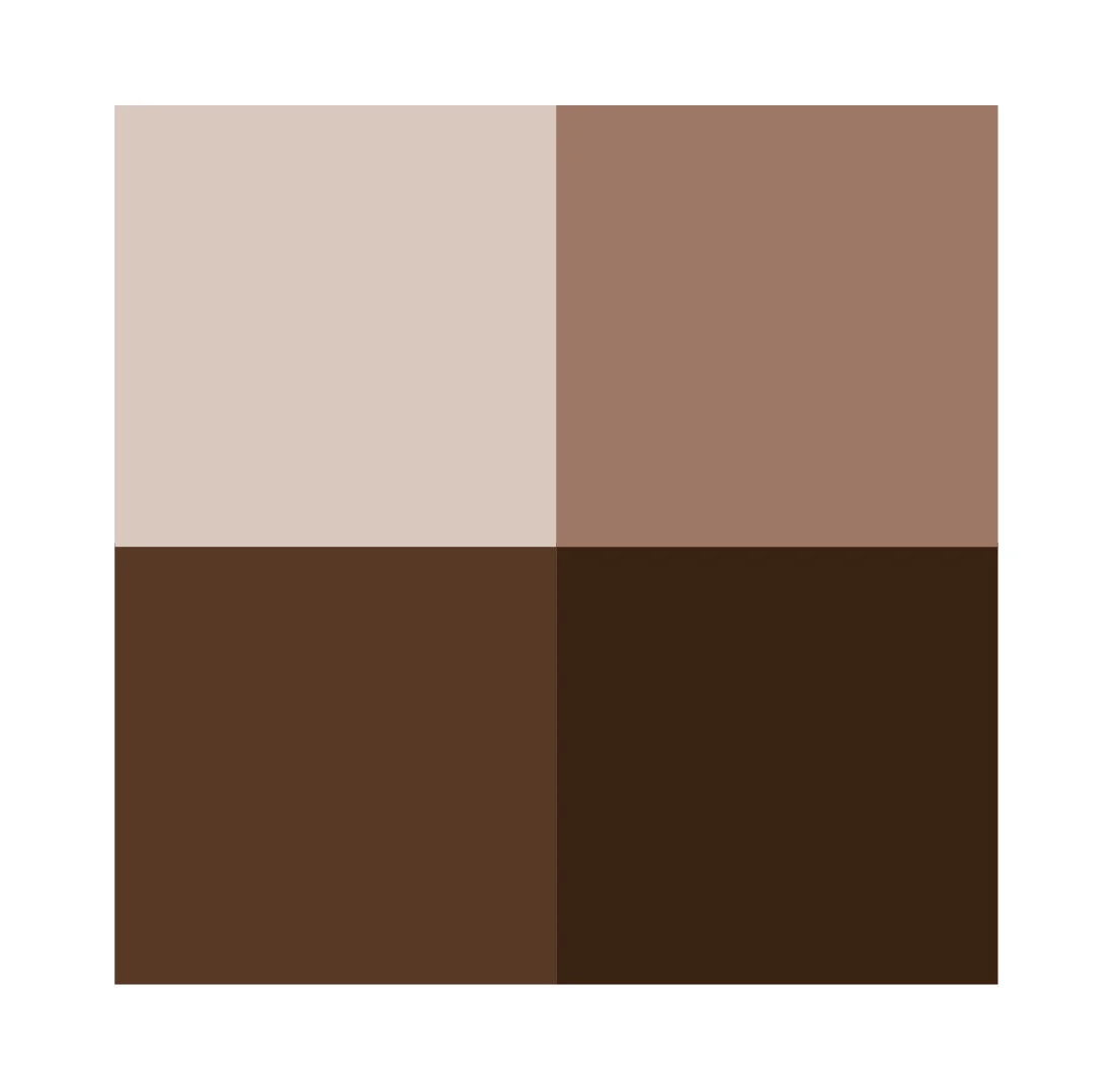
Brown - The color of chocolate

Mint - The color of coconut trees, one of Ben Tre's prominent trees

Yellow - Ben Tre is known as a coastal province, yellow is the color of alluvial water.
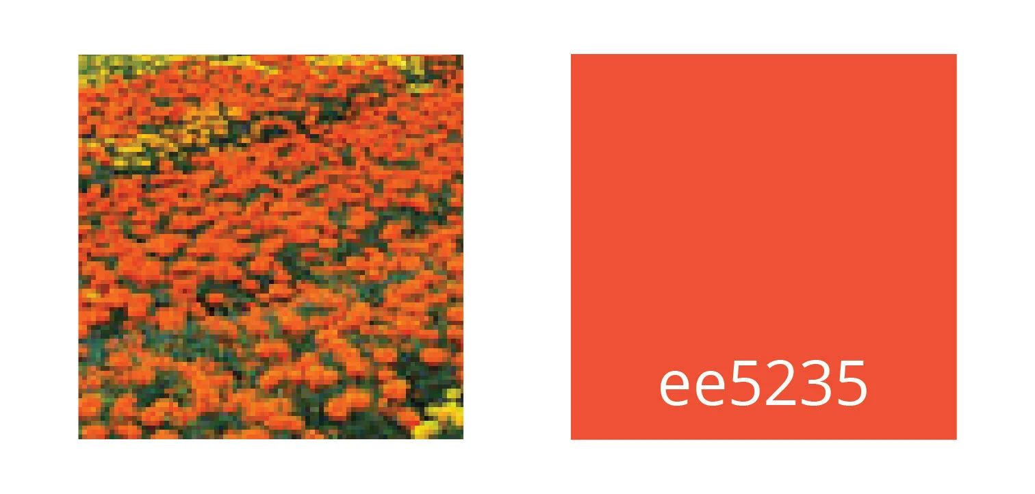
Orange - Ben Tre is also famous for having flower fields, orange is inspired by the poetic beauty of this place.
COLOR SYSTEM
Tints and shades of the original color are added to the color system to bring more dynamism to the brand identity.
Colors can be used in monochromatic tones or can be used interchangably.


Elements used in stationary applications are of the logo, logotype and supporting graphic.
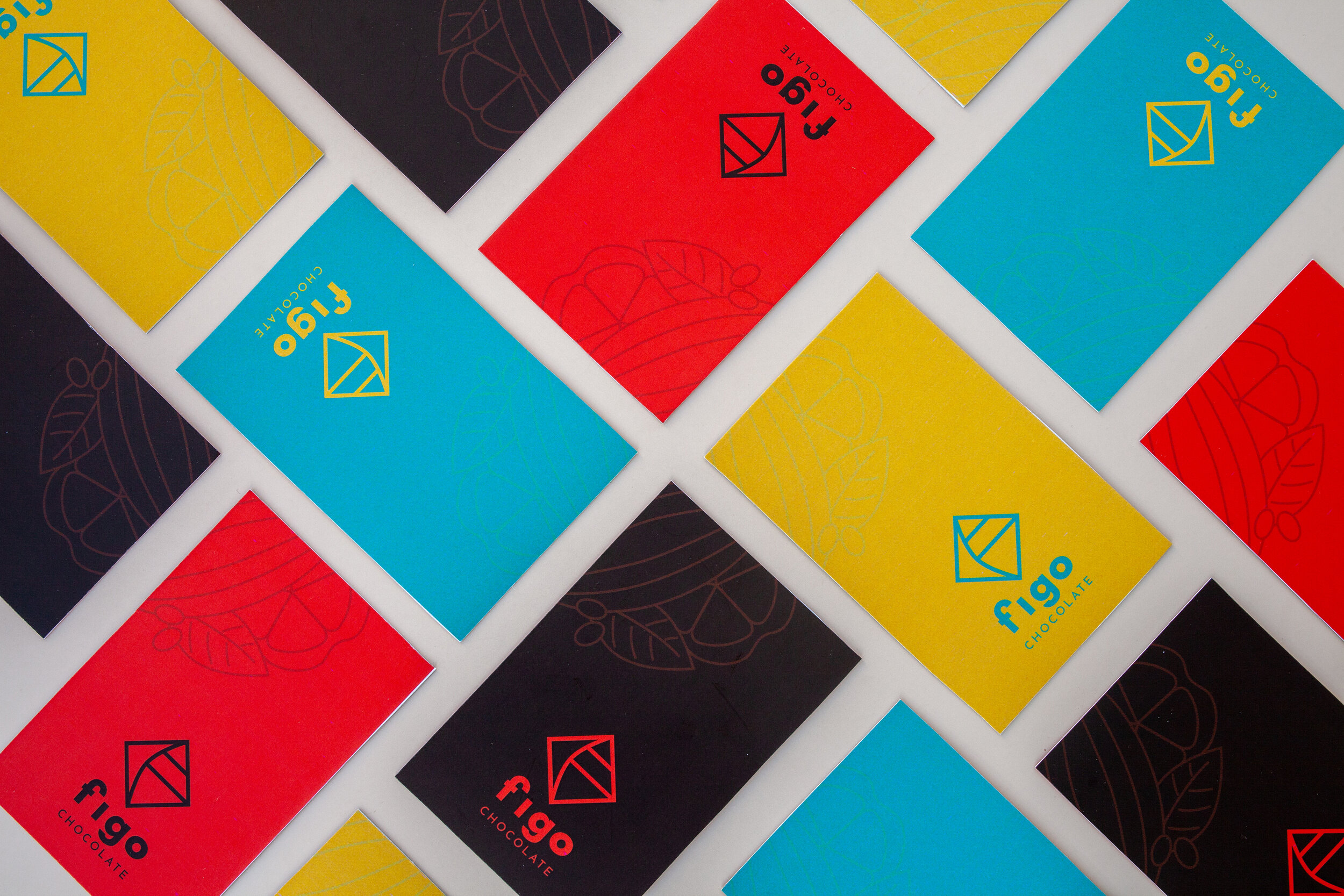


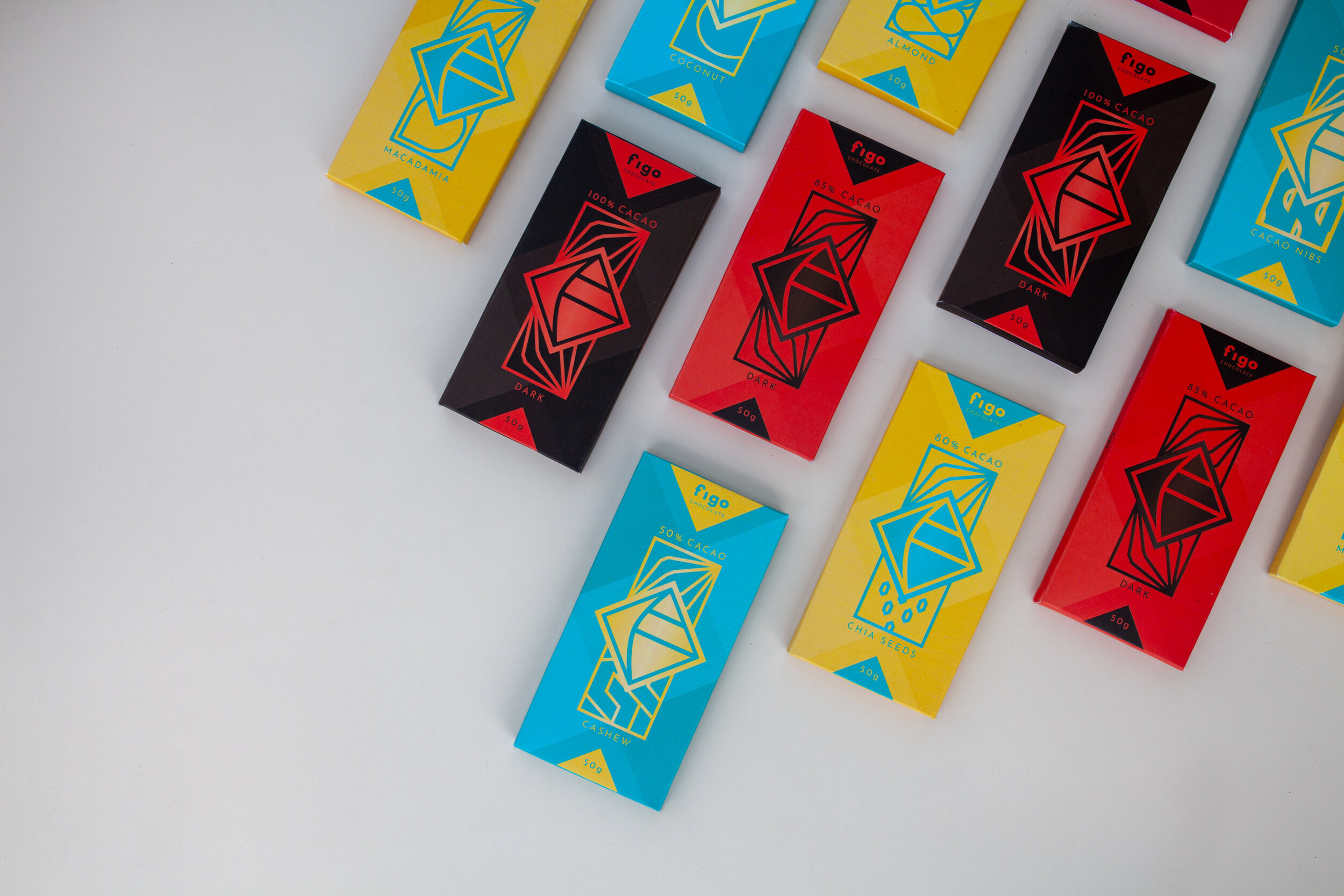
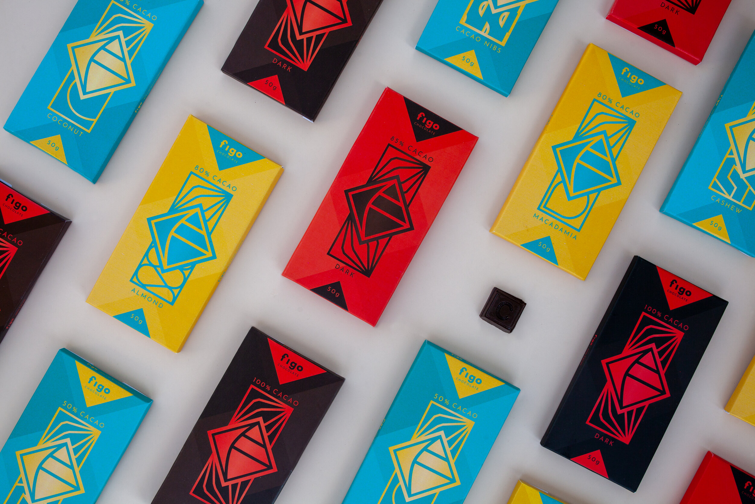
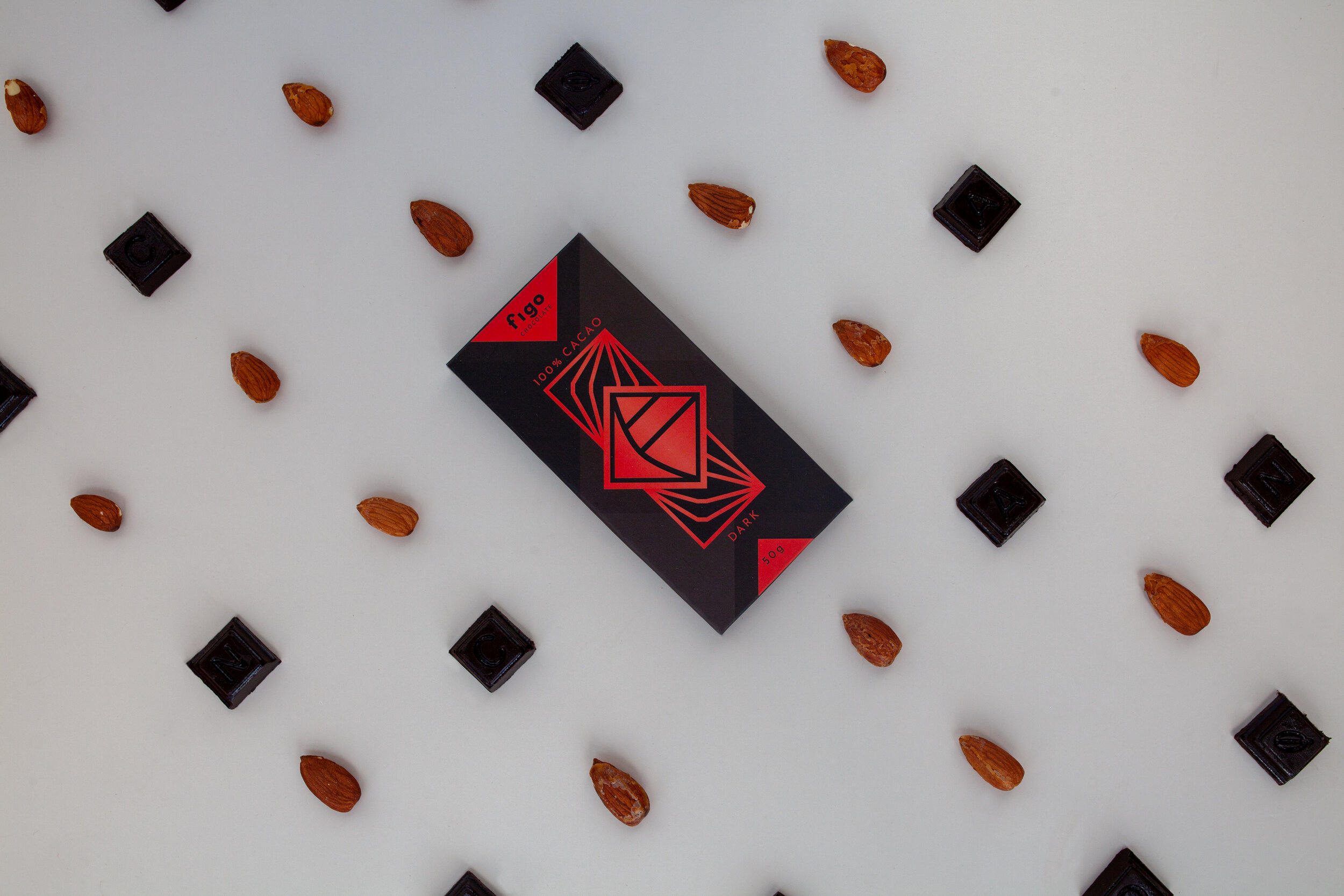
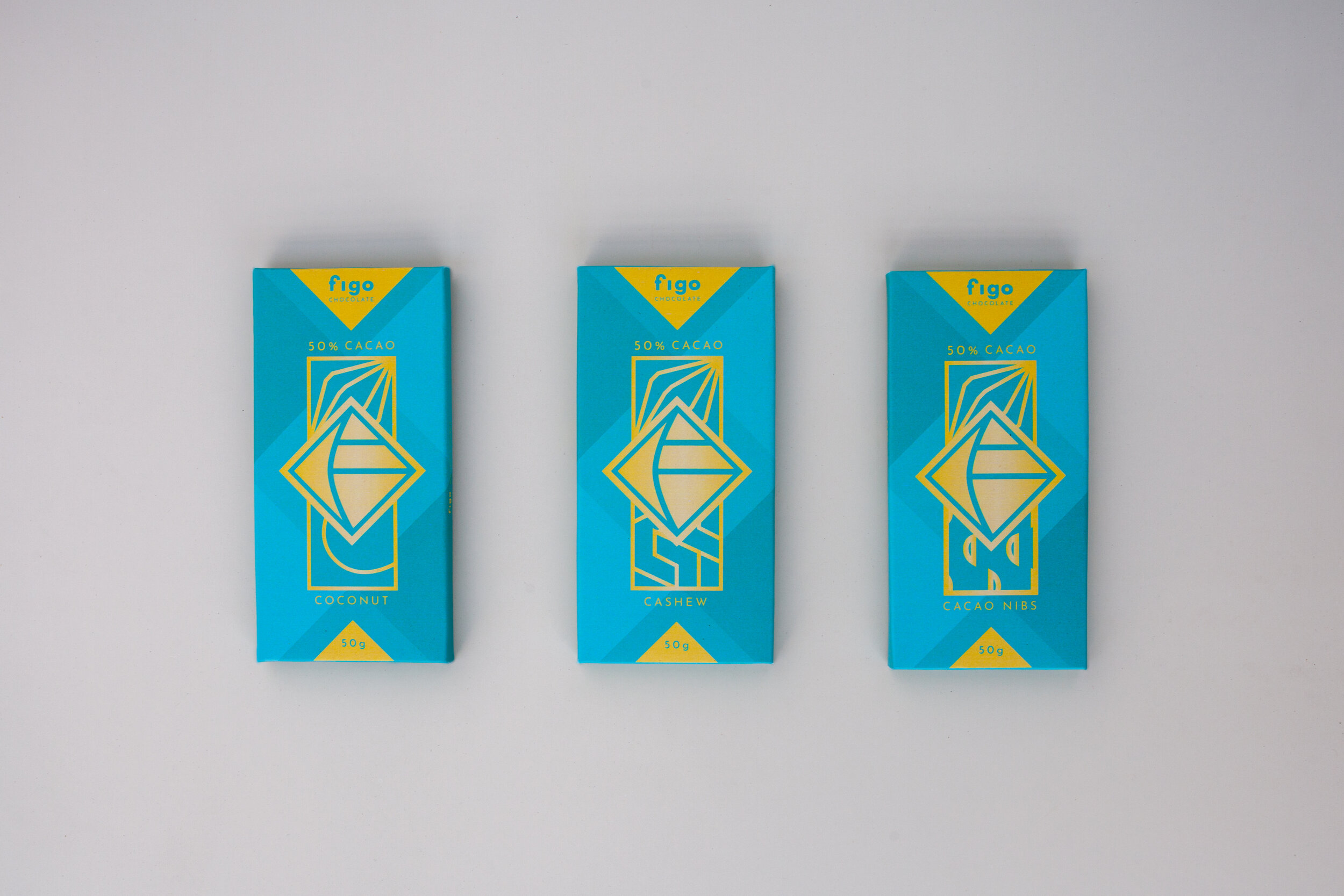
Being a well-known name in the chocolate market, people may have heard of the name Figo and our goal now is to make customers recognize the brand identity. The packaging of the chocolate bar is changed to a modern style but still highlights the brand value - the strength of Figo.
GRAPHIC
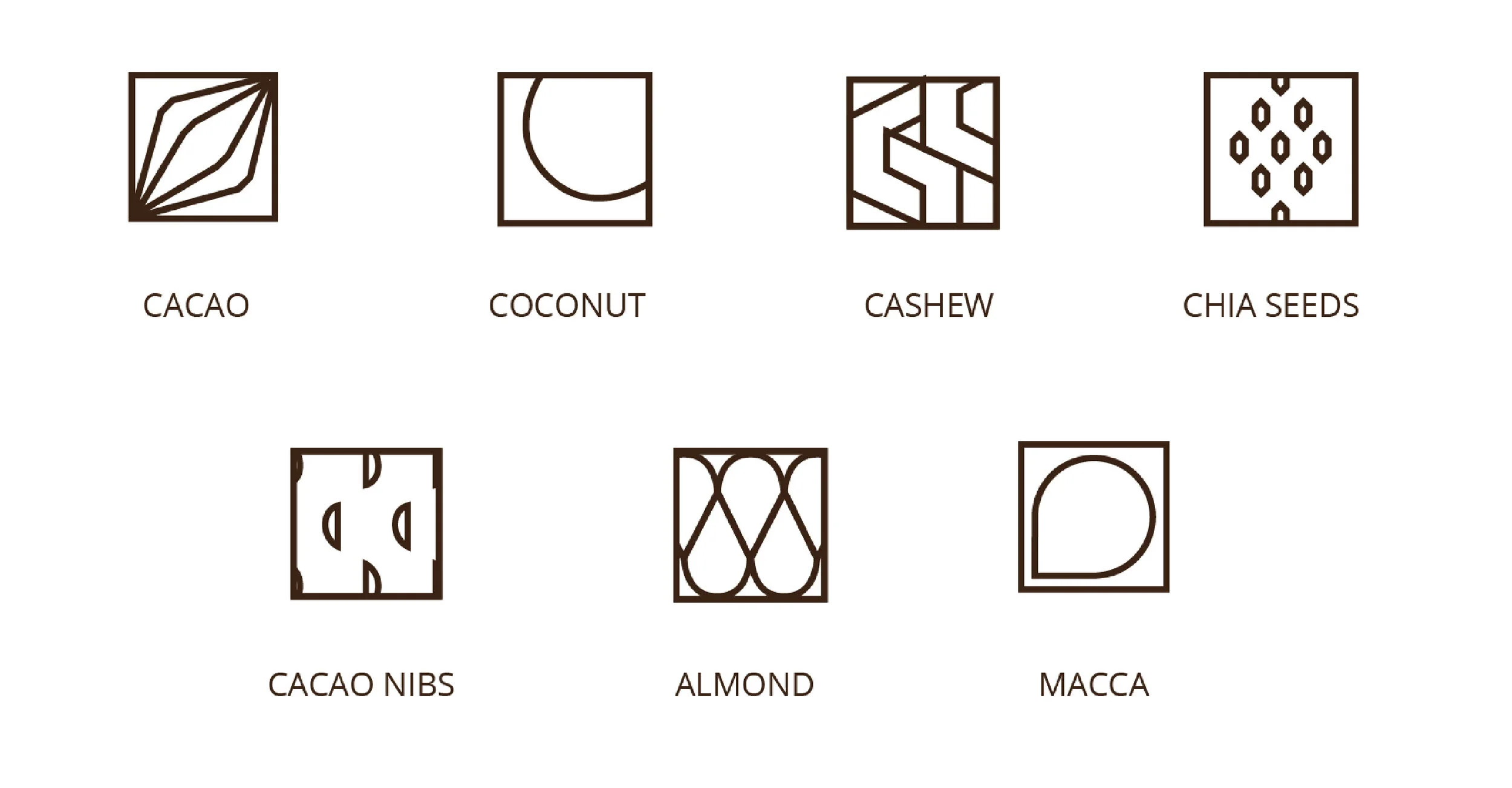
The icons for flavors is the continuation of the basic geometry concept, derived from the logo.
BACKGROUND

The background is formed by monochromatic colors based on the color system to create a lively look to the overall packaging.


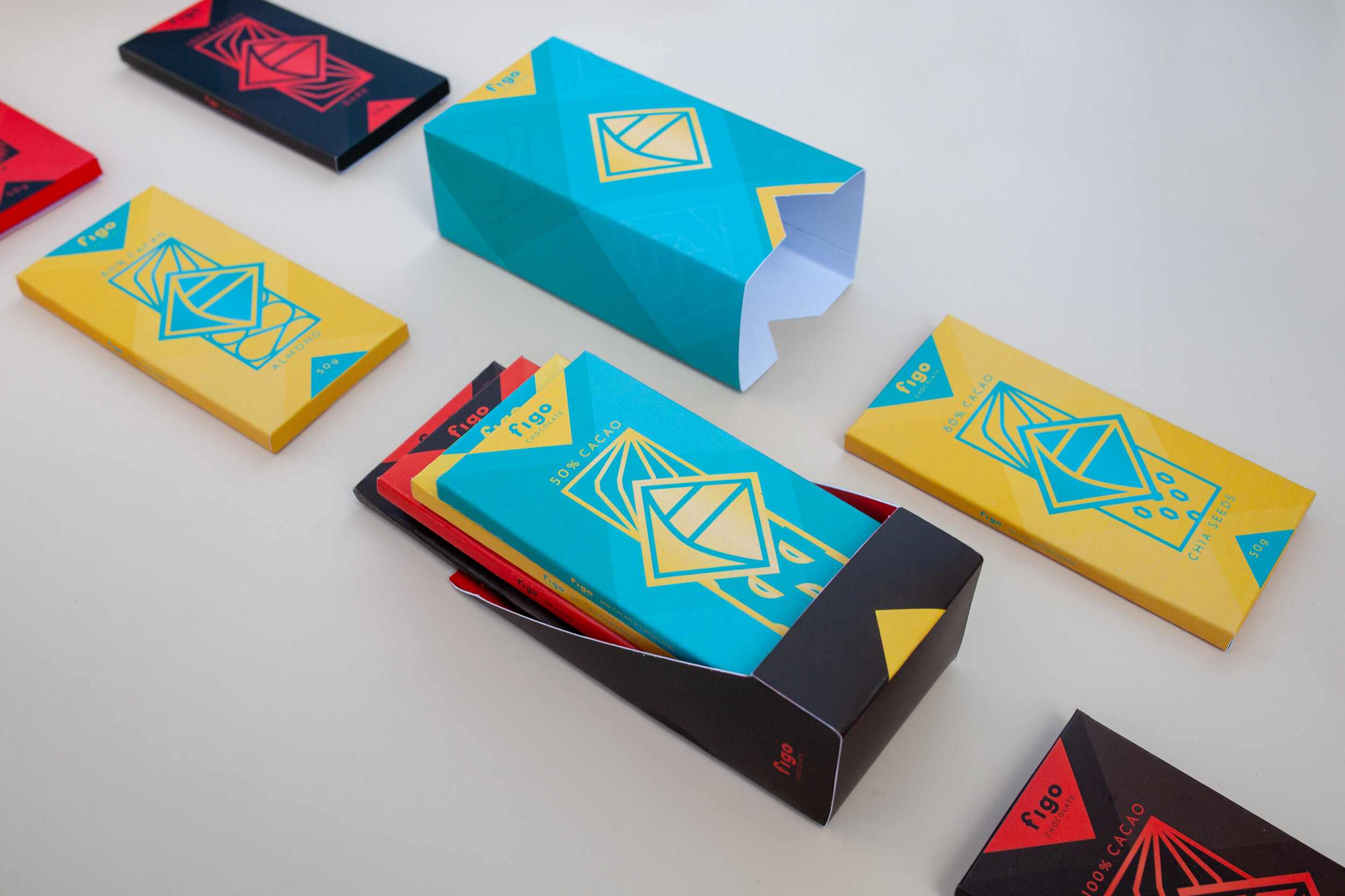
In addition to retailing chocolate bars, Figo also sells chocolate in a combo, each consisted of 5 chocolate bars with different flavors. This combo package targets customers who want to send chocolate to others as a gift or foreigners with the desire to try different Vietnamese chocolate flavors. The redesigning of Figo’s combo will create a handy, simple yet unique design.
GRAPHIC
The design of the chocolate combo derives from the chocolate bar. In terms of design, there is an addition of flavor symbols to the background, which presents that the combo box is a combination of different chocolate types inside.
PACKAGING
Figo combo consists of 2 parts, the inside, and the outside. The interior of the packaging design is inspired by the chocolate display box, which is not only convenient but also familiar. The two pieces, when combined, have the shape of a simple box but still make a difference.